Frustrating web design #1: AT&T
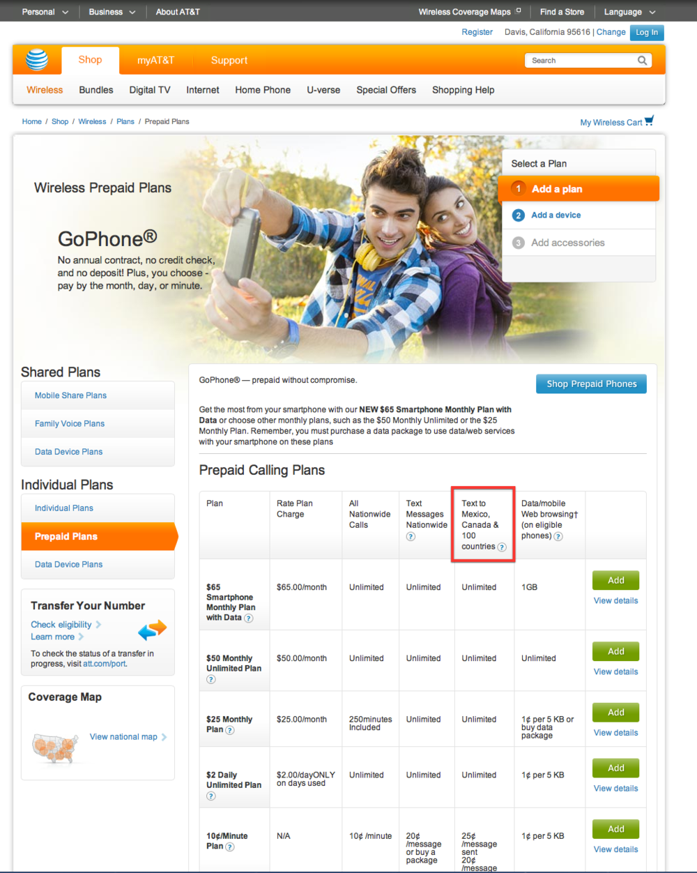
Earlier today I was trying to see whether the pre-paid phone plan that my inlaws are using during their visit here would allow them to send texts to the UK. A quick trip to a page on AT&T's website almost, but not quite, revealed the necessary information.

The box highlighed in red says Text to Mexico, Canada & 100 countries. In order to find out what those other 100 countries are, I tried mousing over the question mark symbol. This short video shows what happened next:
That's lovely AT&T, make me have to copy a URL by hand and type it in. Because the web is much more efficient that way.