Amazon's not-so-subtle influence on IMDb

Since 1998, IMDb (the Internet Movie Database if you didn't know) has been owned by Amazon. The online retail giant clearly has business interests that could benefit from ownership of a site like IMDb, and it might not be unexpected that they may wish to monetize the site by placing strategic ads. The IMDb homepage has remained largely free of advertising content though. E.g. here's how it looked a year ago:

Maybe Amazon are now falling on harder times, or maybe they have a lot of Hobbit DVDs that they really need to shift, because this is what greeted me today when I opened the IMDb home page on my computer:

Not altogether subtle. And what if you want to actually use IMDb to find out some more information about this latest installment in the Hobbit film series? Well, this is what you must endure:

This is horrendous. This is the IMDb page for a film…something which has, in the past, always given the reader an encyclopedic view of a movie. Now you have to scroll down to see any useful information and even then it is not easy to discern the actual content from the overwhelming amount of advertising material. What happens if I mask out everything which isn't actually IMDb info about the film?

At what point should we become concerned by Amazon influencing the IMDb ratings of movies that they would rather see portrayed in a more positive light in order to sell content from Amazon.com?
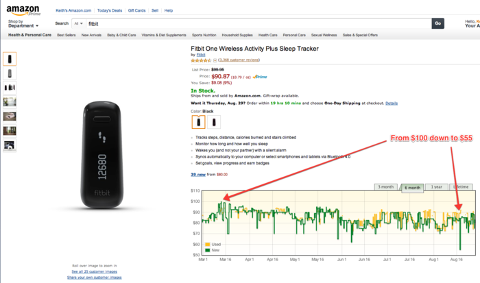
Monitoring the wild fluctuations of prices on Amazon

I've recently started using a price-tracking service called The Traktor. A simple browser extension allows you to track the price changes of products on Amazon, and optionally be alerted when a product drops below a target price.

The tool also embeds price history graphs on the Amazon pages of each product. It's a little bit crazy when you start noticing just how often Amazon changes price. It's not just by the day, it can vary by the hour. For example, consider price changes over the last six months for the Fitbit One activity tracker where the price is almost halved, albeit for a few hours (click image to enlarge).

I guess it can pay to watch those prices closely (as long as you are prepared to wait).

Visualizing changes in the share price of leading tech companies over the last decade

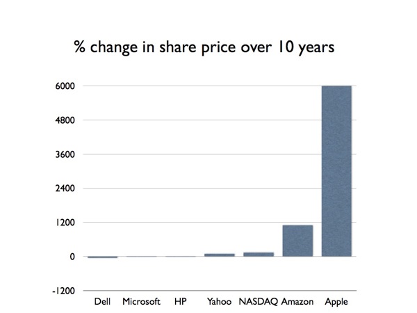
I was playing with the stocks app on my iPhone when I noticed that the landscape mode now allows you to look at time spans of 5 and 10 years. I quickly played around with how some big-name tech companies had fared over the last decade. I tweeted the results but was then curious how these changes in share price would look graphically:

Share prices 001

The NASDAQ index is included for comparison, though obviously the growth in the NASDAQ is partly due to the growth of some of these companies. Google is excluded because there’s not quite a decade of data yet, but — if you’re curious — their share price has grown 670% over ~8.5 years.

Dell's share price has actually fallen (-53%), so it is hardly surprising that Michael Dell wants to buy back the company. Microsoft and HP barely register on the chart, both with single-digit growth. There may be a problem with my calculations though because I was led to believe that Apple was doomed.