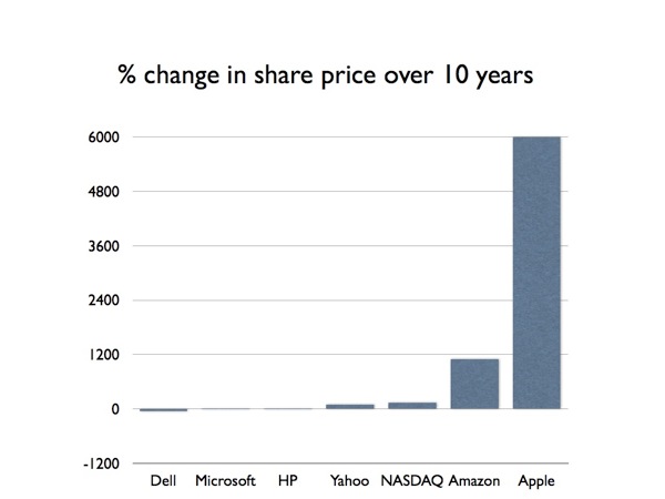
I was playing with the stocks app on my iPhone when I noticed that the landscape mode now allows you to look at time spans of 5 and 10 years. I quickly played around with how some big-name tech companies had fared over the last decade. I tweeted the results but was then curious how these changes in share price would look graphically:

The NASDAQ index is included for comparison, though obviously the growth in the NASDAQ is partly due to the growth of some of these companies. Google is excluded because there’s not quite a decade of data yet, but — if you’re curious — their share price has grown 670% over ~8.5 years.
Dell's share price has actually fallen (-53%), so it is hardly surprising that Michael Dell wants to buy back the company. Microsoft and HP barely register on the chart, both with single-digit growth. There may be a problem with my calculations though because I was led to believe that Apple was doomed.

